Friday, February 28, 2014

End of the month

Wow just realized today is the last day of February. I set the goal to attempt one painting a day, and I almost did that due to one sick day, but on some days I painted more than one. Today's painting is a failure, perfect way to end the month?

socre:
threw out: 5
kept: 30

I guess it's not too bad, plus I have learned a lot and had fun.


I did this one a couple days ago and I ran out day light so I wanted to come back for another session.


But I came back on a wrong day. The sun was too bright today, creating too much contrast and lines and complexity, and I got frustrated and didn't end up with a good painting.


I did find another nice spot on paint on this trail with beautiful back lit fern, so it's not all bad.

plein air and changing light

Unless I paint on a gray day or cloudless high noon, I have to deal with the changing light. Since the day time is shorter in the winter it changes faster as well. In this case I started around 3:30 after visiting friends, in 2 hours the view is bathed in orange with longer shadows. You can see how my colours are more towards the 3pm neutrals but with accents from the 5pm orange and the longer shadows. Since I started painting late, I had to embrace the changing light. If I wanted a more constant light I should be out painting before noon, but in this case I couldn't.


Shadows moving in - oil on panel - 9" x 12"


3pm light


5pm light


almost done


Wednesday, February 26, 2014

Melting snow

I made up for my sick day and did 2 paintings yesterday at Kits Beach. It was still chilly but the sun was very warm. It felt like spring, especially hearing the Black birds squabble in the back the whole afternoon.

I looked for an interesting design instead of a grand view. There are many grad views at Kits Beach and I intend to return to do more, but not yesterday.

The patterns of the light and shadows on the snow, grass and pavement caught my attention.

Design of the melting snow - oil on panel - 9" x 12"


Another angle from just up the road. Again not a grand view but a simple composition and it makes me feel cheerful.
Spring at Kits Beach - oil on panel - 9" x 12"


Monday, February 24, 2014

Frank Benson “Advice to Artists”

Came across this recording of Frank Benson's Advice to Artists.

http://thebostonschoolofpainting.blogspot.ca/2012/05/frank-benson-advice-to-artists.html

I wish to find more wise words like these.

snowy days!

When I first started to paint, I lived in Toronto. It's winter there almost half a year, so there was always a snow scene to paint. Snow here in Vancouver is kind of a rarity, not to mention the continous snow we have been getting the last 2 days, and it is still snowing now.
Snow is kind of like fog, it reduces visibility, heightens the sense of depth, lowers the contrast, desaturates colours as well as softens the edges in the distance.
When I went out looking for a snow view to paint last 2 days, I looked for little sky, since it's all flat and boring; I looked for a vanishing point with clear definition of depth to take advantage of what the snow brought me.

Pale ale - oil on panel - 9" x 12"

The city beneath - oil on panel - 9" x 12"

I painted both of these in the car as it was snowing pretty hard, I didn't want them to hit the palette and melt. I have a suspicion the oil pigment I have mixes with the water, next time I will try a grade up, they just get so expensive so fast. Painting in the car is quite comfortable, though I had to roll down the windows a bit so the windshield wouldn't fog up. I also had to leave the power on to run the windshield wiper once in a while.


Saturday, February 22, 2014

catching up

This is from 2 days ago.
Looking for a motif to paint in the dark is very different than during the day. Usually I am looking for silhouettes, and big shapes that give me distinct colour variations. I drove by this little creek next to the airport. Cypress sky resort had its bright lights shining into the cloudy sky and the creek reflected it.

Cypress lights up the sky - oil on panel - 9" x 12"


Yesterday we went to Deep cove. It's my second time there and still so captivated by its beauty. Almost anywhere I looked I could paint it. This view is facing north east, so I had the sun on my back shining on my painting and palette. It's the first time I tried not painting in the shade. I have always wondered about how that wouldn't make you paint the painting too dark since ultimately the painting will be viewed indoors, but I have read about people painting like this with success including Marc Hanson. I did put on my sunglasses so I wouldn't be blinded by the bright canvas the whole time.

The painting process was fine, smooth, and whenever i took off the sunglasses to check for real colours they always seemed right, but when I brought it home it does look darker than how I intended, and it actually looks bluer too. As I said I checked periodically without my sunglasses so I don't think it was them, I believe it was the sun. I still want to try painting with the sun on my back again and see if I get the same result, because it really frees up where I can setup without having to look for shade.

Deep Cove calm - oil on panel - 9" x 12"

My cellphone pictures doesn't do it justice at all... The sailboat in the picture is anchored, but it kept spinning. I wanted to paint it facing right but I had to wait for it to spin to that direction on about a 5-10 minute cycle.


It's hard to just do one painting at a place this beautiful, so I found another motif to paint (5 meters away looking east.) In order to paint this I had to check the tide to make sure it's going out not coming in because I was standing below the tide line, glad it was going out.

Playground for all - oil on panel - 9" x 12"


Thursday, February 20, 2014

I need a not ever-changing day!

This week the weather has been very predictable, by that I mean I know it doesn't stay the same for 5 minutes. I think it'd be great for a photographer though. When can you find rain, shine, and majestic cloud covers all in one day? But it makes it challenging for painting on locations.

When I arrived on the first location, looking over these houses on a hills into the endless mountain ranges, it was just breathtaking. The clouds however moved way too fast, and so was the light. The consequence of that was a rushed painting that tried to capture everything and captured none. The reason for me to paint on location it to be able to have that direct feedback from the world that is 4 dimensional. There is the X Y Z and the time as the extra dimension. Time is important because it gives me a range of light and colours to choose. That's also why some portrait painters like to work with live models and interact with the models at the same time instead of from photos. It allows them to capture more facets of their subject instead of just a slice of time at 1/250 of a second. Back to my painting, it did not capture the essence of what I saw, so when I went home I pretty much reworked the entire painting based on the photo I took, and the colours from what I remembered. Can you tell?

In order to produce a good painting for me, I simply cannot be rushed. I need the time to strategize, plan and think along the way. If I don't I quickly lose track of where I am and where I need to be and the painting falls apart. This is all part of the learning process though. As I grow as an artist I will have better instinct and knowledge about working outdoors.

clouds slow down - oil on panel - 9" x 12"

I was pretty disappointed after the first painting, it was about 5pm and I decided to do a dusk painting where I would paint into effect. I drove around and found a nice view looking north east and the Lion's Gate bridge (I think so). I set up on a hill and did the drawing as the day was still bright. I started with the sky, water and land and kept changing them to stay in sync with the time, and when I reached a precise time I would move on to do other parts of the painting. When I got to the houses they were near pitch dark, and make nice silhouettes in the foreground. This is the first time I painted in the dark with the book light on, and I loved it!

Lion's Gate activities - oil on panel - 9"  12"

This is when I first started


I am looking forward to the summer (I say that now), when the days are longer and more clear sky, where I will be able to slow down with painting.

Wednesday, February 19, 2014

Road not to Captital Hill

I didn't get a chance to post yesterday, so here are the 2 paintings. I actully did three, but one is pretty horrible so I scraped it.

In this painting I was drawn to the colours and shapes of the cloud. In the sky there were blues and yellows and the clouds purples. I liked the complimentary combo and wanted to capture it. Of course the clouds were moving fast and during the process it was different every minute, so I mostly painted from memory and studied what's in front of me to add authenticity.

cloud study - oil on panel - 9" x 12"

Yesterday was another sunny, cloudy and rainy day. Even though on my way out it was not rainning I wasn't going to take my chances. I stayed in the car and guess what, it rained on and off throughout and I would turn on the windshield wiper once in a while to clear the drops off.
This view wasn't that appealing, it was more for the convenience and retrains from where I could park the car without obstruction, though it still made a good target for me to practice comparing values and identifying big shapes.

Road not to Captital Hill - oil on panel - 9" x 12"


 And of course the sun would come out beautifully at the end.


Monday, February 17, 2014

5 o'clock murder

It poured all day again. I stayed home and finished a couple paintings. When it was getting darker I decided to paint the scene from the back yard.

5 o'clock murder - oil on panel - 12" x 9"

In order to complete this painting, I started at 4:30 to block in the shapes, 5 o'clock the daily migration of crows coming to roost and I tried to capture a few in flight. 5:30 the sky got to the deep purple I was looking for and that's when I combine all the elements and finish the painting.

Lots of great artists painted night time scenes. From the top of my head there are Isaac Levitan, James Abbott McNeill Whistler and Marc Hanson, look them up if you haven't.


Here is the updated "A rainbow kind of day". In a previous post I talked about finishing the painting with some foreground elements. Here I added some shrubs and poles and wires leading to the top edge, completing a spiral that leads the eyes to the boats. I also added a bald eagle to the top of the pole to insert my memory.

"A rainbow kind of day" - oil on panel - 9" x 12"
 

Sunday, February 16, 2014

Inspiration from Edouard Vuillard

Yesterday it rained all day. In the evening I decided to go out to paint in spite of the rain. We drove for a while and I couldn't find any view that I was satisfied, and that the rain turned into down pour, so we went to the grocery store instead.
When we got home, I decided to do an interior painting. I have always loved the interior paintings by  Edouard Vuillard, so I wanted to do one inspired by him.

Heather in her rocker - oil on panel - 9" x 12"

Vuillard's interior are like no others. They are complex, full of patterns and details. The rooms are often filled with oriental rug and decorative wall papers, paintings on the wall and fine furniture. His renditions of them are so organic and rich. I love how he includes figures in the interior like them belong there. In wild life painting, many painters paint a tightly framed animal, and it usually looks dead and unappealing. Robert Bateman on the other hand, always shows the habitat in which the animals live, sometimes the animal is so small you can to look for it. He gives the animals a context and that makes his painting much more personal and intimate, and to me that what Vuillard did too.

I worked all night on this with Heather sitting for me when I had finsihed most of the interior. This morning she sat for me so I could finish it. She sat for about 2 hours, 1/3 of the time holding the baby, I really appreciate it. 

Here are just a few of them by Vuillard so if you can get an idea of what I was after if you have not heard of him.

Edouard Vuillard: 'Madame André Wormser and her Children'
Edouard Vuillard: The “Voiles de Gênes” Boudoir ,1931
  Edouard Vuillard: La Comtesse Jean de Polignac., née Marie Blanche di Pietro, 1932, in her boudoir

Saturday, February 15, 2014

A rainbow kind of day

When I got there, it was cloud. Later it turned sunny with blue sky and near the end it was pouring rain. At least I got to see 2 rainbows and a bald eagle.
The lights and the clouds were moving so fast, I got frustrated chasing the sky, so the more detailed volumes were added back at home. I tried to squeeze in all the elements I experienced: cloud covers, blue sky and rain.
When it started raining I didn't think to use the umbrella so the palette got wet and I was unable to mix and had to leave early. Once the painting is dry though, I want to add a utility pole with a bald eagle on top and some trees at the foreground. The eagle was just sitting there to the left a little outside my composition

oil on panel - 9" x 12"


You can see here the weather changed many times.


Excuse my bad photo but the last picture you can see the rainbow in the centre of the picture.


Friday, February 14, 2014

What I am learning

As I am picking back up plein air painting in oil, I am looking at paintings I admire and watch how the artists paint them.
In particular 
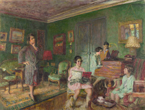
Marc Dalessio's work speak the most to me. He paints many ordinary scenes, but turn them into little jewels. In his paintings I can see the strong sense of design, great drawing skills, great control of the brushes, and most importantly a passion for capturing the scenes. His work ethic is also an inspiration to me.
To me it's very important to study paintings that inspire me. There's no point to look at paintings that I do not enjoy, because I don't feel the drive to dissect and learn from them. In Marc's paintings, I can look at how he simplifies shapes almost to the extreme, breaking complex foliage into flat shapes based on values. As long as the composition is sound, and the values are precise, they look spectacular.
When I go out to paint, I like to think about what I have learned, and try to apply them. Sometimes it just doesn't work, either it's because I don't really understand the method, or it's because it just doesn't work with how I work.  But when it works, it's so rewarding.

Some things I have learned recently that I find absolutely works with me:

1) Sight sizing:
I have never been taught this before. Marc's youtube tutorial on that is great. whenever I painted before, I always found it a chore to bring out my viewfinder, tighten it to the view I want to frame, and hold it there as I marked down the boundaries to the painting surface. Once I have the boundaries landmarks I could work my way in to fill out the rest of the drawing. With sight-sizing, it's much easier. I set up my pochade box so it's the height of the subject (so far it's always slightly higher than my eye level), and just dart my eyes left and right to practically duplicate what I see onto the canvas. Of course I still have to mark down some lines to secure the compostion, but it helps so much. It also helps getting colours and values right easier, because darting my eyes left and right I can compare 2 images (the view and the canvas) more easily.
I find though, painting when the painting support is higher than eye level, my arm gets really sore lifting after a while, not sure how to fix that.


2) Work slow:
I always had the idea that to have an expressive painting one needs to painting expressively and fast. Over the years, I watched some good artists painting including recently Marc's demo in Switzerland. He works so slow and careful! He works over the surface gently and get the edges sharp meticulously and they still look expressive at the end. In my early painting years I thought my paintings looked alive and passionate, but honestly looking back, some were very sloppy and messy. I believe now to make a good painting one needs to think while he paints too, it's an intellectual process. Painting slowly, I can have time to make sure my colours/values are more correct; I can make sure I have covered all the thin transparent area because I start adding opaque colours on top; I give myself more time to revise my drawing and shapes as I go.


3) Steady hands:
This kind of goes hand in hand with point 2. I have never bothered with a Mahl stick, but now I would really like to have one. It doesn't mean that to work slow and steady you will end up with a stiff painting. To be steady you will get more precise lines work and more perfect small shapes. One thing about working en plein air on small scale is that, it's hard to make the painting look grande compared to a studio painting, because the lack of smaller finer details. So if you don't have small shapes to show scale in the plein air painting, it can look crude and amateurish.


4) Key the sky first:
Again, another one of Marc's approaches. I have been trying it out for the last 2 weeks and I want to keep doing it for now.


5) Use less paint:
This doesn't apply to everyone, but it works for me.
Thinning paint to me always meant adding turpentine, but now I have a new understanding.
Basically, you don't need a lot of paint to cover the surface, especially if it's not the top layers. If the paint is thick, where it touches the support is gripped/absorbed by it, and the excess at the top is loose. When you apply another layer of paint on it, the 2 layers of paint mix and you have smears. Even to thin with turps, you want to make sure your brush is not loaded with paint for the bottom layers.
For the top level, you apply the fat over lean rule. Fat doesn't necessarily mean more paint, it can be fattened with medium (linseed oil for example). For the bottom layers you either use little paint, or dilute with turpentine to thin it, or together.


6) Don't use largest brush possible:
This is what I heard before: "Use the largest brush possible." I find it doesn't work for me. I find to use a brushes a bit smaller than the shapes I want to make give me good results. If it's too big, it's harder to control and it can end up looking crude and boring. I like my paintings to look elegant and with variation in every area. With smaller brush I can achieve that.

The sun and the moon

Yesterday the sun was going in and out of the clouds and I wanted to have a back lighting (Contre-jour) painting. I drove for an hour and could not find a suitable view. I did find many views but they all had the sun behind me and I did not want to hold the umbrella for 3 hours.
Eventually I went to Iona Beach, which was quite a way from where I live. Even there I couldn't find a view with nice foreground, I ended up with this very minimalistic composition.

I had to wear the sunglasses the whole time until the sun dropped near the horizon and lost its intensity. I have painted with sunglasses on before and I don't find it too big a problem. Basically I mix paint as I see, so when I take the sunglasses off at the end it should be as though I painted without them. I did take them off intermittently to check the painting though. A side effect of staring into the sun was that when I looked at the painting I would see green dots all over almost the whole time. I didn't paint that effect into the painting, but Monet did (different effect).

I tried a few ways of painting the reflection on the water from the sun but couldn't get a good result. To flatten a such bright area into a narrow gamut of values from black to white was not trivial to me. When I went home I repainted the water based on how I remembered it and I am still not sure if it's the best solution.

February sun at 3:30pm - oil on panel - 8" x 12"


When I was done with it, the sun was near the horizon and the sunset colours were brilliant, but I didn't plan a sunset painting so I left the painting as it was. When I turned around to see how the landscape has changed over the hours, I couldn't believe my eyes: moon rise!  I had always wanted to paint a moon rise and I loved the colours. It was a fumble to set up the tripod because I knew it wouldn't last 5 minutes. I didn't even have time to find level ground, I was painting this with a half squat because my stool was about 45 degrees crooked.


Moon rise over Iona Beach - oil on panel - 9" x 12"

To paint quickly, I didn't have time to even key the sky first, I had to go straight to the clouds since they were changing the most, then the sky, then the moon, then the land. The order of process has its problem. Since the moon was the brightest thing there, it should be keyed first, since in painting I can only go as bright as white. The result was that the sky was in similar value as the moon. At home I took the sky down a shade so the moon would seem brighter. Also, below the horizon was too bright too. I blame it on not using the book light when painting. Look at the photos below, the lighting was pretty dimmed then. I painted under that condition, of course when viewed in bright day light the painting would seem too bright.


On going lessons:
-relative value, compare, compare, compare.
-use book light to paint if outdoor light gets dark.
-If there's no time to key the bright thing first, make sure the first thing I paint has proper value compared to that.

Thursday, February 13, 2014

Wellingdon cloud formation

Yesterday the clouds were magnificent. Lots of voluminous and dark clouds. Depending on which direction you look you get different enjoyment.
I wanted a view that gave me the best cloud view, but in the city it wasn't easy to find. I drove a bit and quickly decided on this angle. The reason was that the clouds and lights were changing fast, if I wasn't decisive I would lose it all.
I will leave the majestic clouds and grand vista for next time.

Wellingdon cloud formation - oil on panel - 9" x 12"

Some work in pogress pictures.


Wednesday, February 12, 2014

Crows at then end of Penzance

Yesterday was supposed to rain but it didn't, that made painting a lot more relaxing.
Three trains went by, each time I had to wait about 5 minutes for the many cars to go by. The horizon line is a little crooked, I blamed it on one side of my camping stool sinking in the dirt.

Overall all I feel like this is one of my most "Canadian" painting so far.

Crows at then end of Penzance - oil on panel - 9" x 12"


Tuesday, February 11, 2014

reflections

Looking at all the landscape paintings I have ever done, I tend to be inspired by rugged, weathered and organic things, whether it be natural or man-made.

I am not much of a story teller. I do not set out to paint an image with a story in mind, or create one after the act. I paint because painting itself is the story. It's a process that transforms what the eyes see into an image composed of dots, lines and blobs of shapes.

The dots are the rocks in rapids, they come in all shapes and sizes, sharp or round, they create resistance and harmony. The lines are calligraphy, thick and thin, straight and curve, they are elegant and full of rigor. The shapes are like land masses on a globe, the continent and islands, big and small, flat and rugged, they are perfectly balanced. With all the element in unity, they reveal us a sophisticated painting.

Here is a quote from Isaac Levitan. I love to paint all places that stir the heart, but his words are beautiful.


"I chose to paint not exclusively beautiful places, but the most simple and ordinary.. revealing those intimate, deeply moving, often sad traits that are felt so strongly in our native landscape and that so irresistibly act upon the soul." 

- Isaac Levitan

Puddles on Skeena

It was down pouring when I left home. I searched for a motif (am I using the word correctly?) that took advantage of the rain. When I got to Aadnac and Skeena I saw this wet road lined with tall trees with character, I knew this was it.

Puddles on Skeena - oil on panel - 9" x 12"

I don't like setting up in the rain, because I have to be very careful not to let rain get on the paints and palette. As soon as the water hits the paint it beads up and will prevent paint from mixing well.

Painting a view like this well will take some practice on my part. I have to admit when I was done at the spot the trees looked a little folk-artsy. It required some careful elegant line work back at home to give the trees character and depth. The decision to allow some groups of branches to turn into a mass and depicting some with precise drawing is also very important.


Lastly, people really need to pick up after their dogs. The first spot had 2 piles of dog doodies emitting a very unpleasant odour, and I had to move.

Monday, February 10, 2014

Gloomy sunset and the Fraser river

You may find this painting familiar, and you'd be right. I painted over this painting. I was not satisfied with how the old painting looked, very plain and lacked form. I also did not like how it didn't show the banks of the river so there's no visual clues of where I was standing and how wide/narrow the river was.

After trying out painting-into-effect, I thought this would be a great candidate to do it again. There was a rain front coming in to the lower mainland from the south. From my living room looking north I could see the cloud front covering most of Vancouver and stopped just short of the mountains on the North Shore. I wanted to do a sunset of this painting, but I wanted a brilliant sunset with nice clouds and clearing with lots of colours.

Anyway, Heather came home and I heard her say that the south near the river is all clear, so we hopped in the car and started driving south to the river. The whole way I saw nothing but clouds and I asked her where's the clearing she was talking about. Apparently we had a miscommunication. Looking north from the rear view mirror I could see the sun hitting the top of the mountains with nice warm colours, but my heart was set on painting the river.

We got to the river, and it looked pretty lackluster, but I could see a sliver of orange through the gray sky. I wanted to wait a bit for the sky to get darker and colours more saturated. I was happy to see the tide had gone down and revealed the bank on the right side with snow on top, nice textures!

The colours never got saturated as I had hoped, but I am starting to feel that the joy of painting and the reward is not the view you are presented with but how it's transferred to the canvas.


Gloomy sunset and the Fraser river - oil on panel - 9" x 12"


Looking at some of the best landscape paintings in art history, I wonder if we were there in front of the view would we be inspired?

Here is a painting by Isaac Levitan, one of my all time favorite painters. When I was at school my animation short was inspired by his paintings. 

Vladimirka, 1892 (79 x 123 cm, Oil on canvas, Tretyakov Gallery) - Isaac Levitan