Monday, March 31, 2014

A few from last week

This is another attempt with the Zorn palette, yellow orchre, Cad. red, ivory black and white. The rain in the distant moved through above me and leave me in a down pour for quite a while, it eventually moved away.

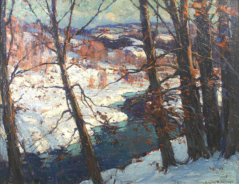
Reflections can come in many forms, most visibly affected by the wind. When it's very windy, the surface is not roughed up, so the reflection is broken up and the water only has diffuse reflection and appears rough. Sometimes the wind only blows on a patch of water and makes it rough whereas everywhere else is smooth and reflective. When there's no wind and no movement of water we have almost mirror reflection (from a low view angle anyway). In this painting, the look of the reflection changed through many phases and when it showed up as in the below picture, I decided I liked it best and kept it in the painting. It's one of the reasons why I like painting on location, it gives me many options and choices that I wouldn't have otherwise from a photo. I am not a very imaginative person so i require nature to give me her many faces.

Red Alder on Penzance beach - oil on panel - 9" x 12"

I still want to do more paintings using this palette, but preferably with the majority of the surface be yellows or reds, so the black would appear more blue.

When I first started. You can see that the reflection is not very appealing.


Here is a more cheerful spring painting. I wanted to paint the cherry blossom so bad I gave this tree cherry flowers even though it wasn't blooming. 

- oil on panel - 9" x 12"


I went back to Barnett park. It offers so many possibility. I added the bare dirt in the foreground to break up all that grass. I think it adds more interest. Have you found the robin yet?

A window at Barnett - oil on panel - 9" x 12"

I am liking painting with the pochade box on my laps instead of the tripod. It feels a lot more intimate to me. I do have to set it down every time when I get up and step back to look at the painting.


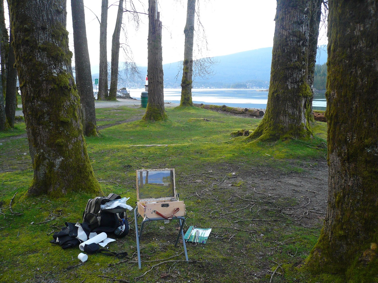
I love it when I don't feel rushed during painting. Here I was sitting near the water at Barnett park, with birds squabbling, mostly seagulls and crows, the robins were singing; a few people were casting crab traps near by, making slashes once in a while; and I was faced with the mirror like water and leaf buds on the birches in stillness, it was perfect.

The hardest part in this painting was to keep the birches dark. They were white, my brain told me they were white, but I had to paint dark browns and greens because that's what they were against the sky, not white. Fighting the convention with the truth that your eyes are telling you requires discipline that I am enjoying learning it.

Los amigos - oil on panel - 9" x 12"


The sun would come out every now and then.

Monday, March 24, 2014

Nightfall at Penzance

I really like painting at dusk or down, the logistic is always an issue. What looks good during the day may not does when it's dark, even if it is you have to adjust the composition to suit the different lighting and the new shapes it creates. When I set up to paint this, I didn't know what it'd look like in the dark, I had to make a decision based on the silhouette, and the overall mass of the darks.


One way to go about it more safely is to scout the location beforehand in the dark, and then go back to it the day after so you can have the precise composition planned.

Nightfall at Penzance - oil on panel - 9" x 12"


Dark oil paintings usually have the problem of having a lot of glare. For picture taking, I took it from an angle where there was least glare (not frontal), then in Photoshop I distort the corners to make it look normal. There are better ways than this such as using a circular polarizer. I do have one but it doesn't fit the lens I was using.

Sunday, March 23, 2014

Penzance beach

This is very typical of my method. I like to find a place that has a lot of potential, and usually somewhat secluded so I can paint in peace, and I go back again and again until I pretty much exhaust the location. As seasons change, it becomes pretty much a new spot again to go back.


Penzance sketch noon - oil on panel - 5" x 7"

Penzance sketch noon - oil on panel - 5" x 7"


The beach is tidal, so before I leave I check the tide charts to make sure the tide is low and that I have enough time to finish a painting.


This one below was done using the Zorn palette even though apparently he didn't always use it, but the name has stuck.


He used white, black, vermillion and yellow ochre. I don't have vermillion, the genuine one is very toxic and I use Cad. red instead. Ivory black when tinted with white has a bluish tint to it, very subtle but when surrounded by yellows can look very blue. In this sketch there wasn't much yellow, instead it was mostly blue, so I shall use this palette again with a more suitable subject.

Penzance sketch gulls - oil on panel - 5" x 7"


I don't usually do vertical format and I like the wide expanse of the landscape. Though to show the vast sky and voluminous clouds I think the vertical format presents many benefits, though square ones can be very good too, gives you the best of the both worlds.
In this painting, composition and positions of the clouds were decided before I started painting, this way even though the clouds move away as I painted my design and composition would not suffer.

Green water - oil on panel 12" x 9"


Friday, March 21, 2014

2 Australian paintes

I stumbled upon 2 Australian landscape painters and I would like to share their work with you.

Arthur Streeton 1867 – 1943

Cremorne pastoral - Arthur Streeton

Still glides the stream, and shall for ever glide - Arthur Streeton


and Tom Roberts 1856 - 1931

A quiet day on Darebin Creek - Tom Roberts

One thing I like about their paintings is that they feel 'timeless'. Their work are not intentionally made to look 'classic' or 'modern', they just look like the artists depicted them based on what they saw, and not what their time and culture imposed on them and I like that. I may also feel this way because they were closer to my time, though I can't say the same for the Hudson River school paintings.

Both of their work seem to show some serious cracking, I wonder if it has to do with certain paint that they use such as Flake white?

Thursday, March 20, 2014

Tiny plein airs

I ran out of my normal size boards and so did the art store, so I grabbed about 10 5"x7" boards to try out. I have seen people paint at this size but could never see myself do it, because I thought I would have to be incredibly detailed to get the painting to work. After trying out a few, to my surprise, they helped me to be more loose. I used a pretty big flat to block in the sky, hills and water, and since the size was so small I did not need to add additional details to make the painting read. Simple shapes with the correct drawing and values made the painting work.


Lone birch sketch - oil on panel - 5" x 7"


I did a couple more today, just as fun. I just put the pochade box on my laps and go.


View from the library sketch - oil on panel - 5" x 7"

Trees at Penzance sketch - oil on panel - 5" x 7"


The small size is also great for capturing the faster moving lights. It takes less time to cover, and less detail necessary to properly use the surface. There is also less investment you put in compared to a larger work, so if the light really moved too fast to capture you don't feel like you have wasted a lot of time. I hope to translate some of the experience to my larger work.

Tuesday, March 18, 2014

A couple still lifes

I have never been a fan of still lifes. They have always reminded me of art classes at school and I have tried to distant myself from them. Last couple days the weather hadn't been nice for painting outside and I have been reading the book "Alla Prima" by Richard Schmid. He dedicated a chapter on Edges. Edge is always something I was aware of but not paid attention to. Looking at his paintings you will see that he pays a tremendous amount of attention to them from studying his subject. The book has motivated me to better my ability to see.

So I decided to do some still lifes, since the light is more controlled (indoor with window light) and I am more comfortable to paint slower. As you can see from the photo these are tiny. (5" x 7")


The first one is our Cyclamen plant. I forced myself to study every edge in front of me, figure out whether it's soft or hard, and make a decision to address it.


Cyclamen study - oil on panel - 5" x 7"


Did another one the day after. These were exhausting, I spent more time painting them than I usually on the bigger 9"x12"s. I think they took about almost 4 hours each. They were exhausting because I had to pay so much attention to every stroke I did. I still painted over certain areas multiple time, instead of getting them right the first time. These exercises of learning to see better have been really helpful and I hope to do more.


Study of dove on fabric - oil on panel - 5" x 7"

Saturday, March 15, 2014

Trail in Confederation park

This one has a lot of details! I had spent maybe an hour walking around looking for a spot and was getting pretty tired. This may not have been the most ideal but I wanted to just paint! There were a million trees in front of me and how to capture that feel with putting in every branch was the question. I ended up with more details than I ever had for my paintings, it's not necessarily a bad thing, it was just the only way I was able to portray all the trees.

Trail in Confederation park - oil on panel - 9" x 12"


Of course the light changed from sunny to cloudy to half way in between. One good thing from painting the woods is I am working up my confidence in tackling a complex subject.

Thursday, March 13, 2014

Spring Robins

It was my first time at Barnett park and I am sure I will go back for more. Sometimes though being at a beautiful place doesn't mean it will actually be good painting subject. I chose to paint through the trees as many landscape artists have done, such as Emile Gruppe and Willard Metcalf.

Spring Robins - oil on panel - 9" x 12"

It gets trickier to paint the scape behind the trees, because it's broken up by the large branches, and once you start to paint the branch and you want to modify the background it becomes problematic. The clouds were moving so that changed everything a lot, and whatever changed on the mountain would change the reflection too, but that also presented more options for me to pick and choose, and that's something that would not happen otherwise in the studio.

I used dark over light and light over dark on the trees so some of them would pop, and some I would let them disappear by giving them the same value as the background, thus create rhythm in them and give the painting life.

Emile A. Gruppe
Emile A. Gruppe
Willard Leroy Metcalf
Tom Thomson - He did a lot of these. I guess when you always paint by the lake you have to find some foreground elements.


Have you found the robins in my painting yet?

The Fallen

This was painted at the Burnaby mountain park. Again, it took a while to 'find' a good composition. Of course, a highly skilled painter would be able to find a mediocre view and create his unique design from elements that are surrounding him/her, like setting up a still life. For me, I need to find a design that's at least 80% to perfection. In this case, the woods was not nearly as dense, and the blue distant mountain was not visible in this angle. I did those changes for creating a better design.

The Fallen (Heather named this one) - oil on panel - 9" x 12"


I feel like I was with Ivan Shishkin sitting in the woods together. Shishkin was an amazing Russian landscape painter who painted many forest scenes in superb draftsmanship. He was able to render super complex views into a pleasing image. Some people may some that it's not as poetic with that level of details, but his skills were without a doubt and should be studied for someone like me.

Ivan Shishkin - Forest

Ivan Shishkin - Dark Forest - 1890

I am starting to grow fond of trees. They have so much character and textures in them. The colours are so obvious I don't feel like I am inventing anything, just paint what I see and I get a brilliant gamut of color variation that is so satisfying.

Monday, March 10, 2014

Edge of darkness

This was a fun one to do. I found this view with a nice silhouette, and as soon as I established the main mass and the darks, the feeling of darkness was captured. As I was painting the fog would roll in and out and I tried to preserve some of that in the distance.

Again it was painted on the Burnaby Mountain park. There are many 'things' I want to paint there but finding a good composition is very difficult. Each time it takes me about half an hour walking around to find it.

Edge of darkness - oil on panel - 9" x 12"

In order to paint in the dark shade of the pines, I used a book light to illuminate the painting surface to bring it more to a level that it will be viewed (indoor lighting). If I didn't I would have painted the painting too bright and it would not have the mystic feel that I wanted to have here.


Friday, March 07, 2014

Burnaby Mountain park

The fog was rolling in as I got to Burnaby Mountain park. What's better than a fog and totem poles?

The gods and people of Ainu - oil on panel - 9" x 12"

The fog came fast and disappeared fast, and changed in thickness every minute, so a lot of it was painted from memory. I also had to move the totem poles around a bit to get a nice rhythm.


When I was about done the fog was completely gone and I was left with a sunny day. I found another subject just a short walk away.

The red and green combo was so delicious I couldn't pass it up even though I knew the day was getting dark. Did you notice it's overcast now?


A lot of the time painting is about finding an inspiration however subtle, and polish it to make it a diamond. I added the rest of the details at home as I lost my daylight.

Almost Christmas - oil on panel - 9" x 12"


Station near Poplar Island

I was in New Westminster and stopped by the river. I am not sure what this place is called, Surplused marine station, Google mape is not clear. It looks like a platform with many cranes, wood planks and metal tubings. I reserved green for only the natural objects, such as the vegetation by the railway in the foreground.

Station near Poplar Island - oil on panel - 9" x 12"


Painting in the car when it's raining always feels cozy.


Evolution of a painting

It's a sound advice to do thumbnail sketches, and sketch out the whole drawing on the canvas to work out any design issues before you proceed to painting, but time and patience don't always allow that.

In this painting, the Japanese maple didn't bother me before I started painting, but it made a busy and confusing passage at the end. It created visual cluster that's not clear. Clarity is a very important part of a good design.


In Photoshop I did a couple versions to see how I could simplify the corner 

version 1

version 2


I decided on version 2, because it establishes that the grass is in front of the road and house, it also leads the viewers' eyes back up and circle back to the left side.
I left the painting on the shelf to dry, and for a couple days, something just wasn't right. It was the house on the far right, it was white, and created a high contrast with the tree. I repainted the house to  dark blue in the same value as the tree, that merged the 2 shapes into one mass. Merging the shapes is another thing you can do with your design. James Gurney calls it Shape Welding.

Changing a big part of a painting like this can be risky, but it has to be done. I really like the quote from Kevin Courter on fixing one of his paintings LINK

" Making changes like this requires taking a risk.  The painting was OK before, but that was the problem – it was just OK.  I wanted something better.  Taking the risk was the only option."

Tree of yesterday - oil on panel - 9" x 12"

On top of that change, I also moved the bush that's overlapping the car sightly to the left, so the overlap is not perfect.

I paint on locations, but doesn't mean that my paintings need to be finished outdoors as well. The painting might look fine out there, but when I come home I can have a change of mind, or see the painting under a new light (literally), and notice things to improve. I need to do whatever I need to do to the painting to satisfy myself, wherever. Whether or not I can call myself a plein air painter to someone else is not of my concern.